FCAP Brand Guide
The visual identity for the Fried Center for the Advancement of Potential. Use these guidelines for presentations, social posts, flyers, and anything else that represents FCAP externally or internally.
Logo & mark
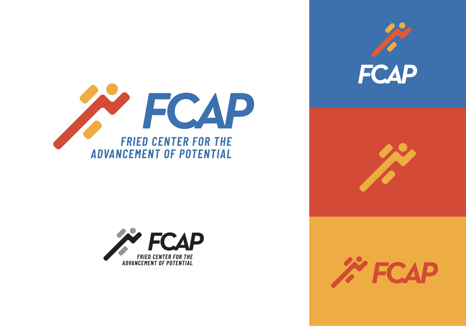
Our wordmark is "FCAP," paired with the four-bar color mark. Use the full wordmark whenever possible. The color mark alone may be used at small sizes or as a favicon.
 FCAP
FCAP
FCAP
FCAP
Colors
Navy is our primary color. Coral, gold, and blue are accent colors — use them as supporting elements, never as the dominant color on a page or slide.
Primary
Accents
Typography
Two typefaces, both free from Google Fonts. Use Montserrat for headings, titles, and short labels. Use Open Sans for body copy and long-form text.
Voice & tone
FCAP's voice is warm, clear, and grounded. We're a clinical and educational organization — our words should feel professional but never sterile, hopeful but never cheesy.
- Be specific. Names of programs, dates, and numbers build trust.
- Center the people we serve. Lead with the participant or intern, more than the organization.
- Use plain language. Avoid jargon — assume the reader is smart but new to our field.
- Acknowledge effort. Internships, recovery, advocacy.
Downloads
Need a custom brand asset? Email info@fcapotential.org.